All work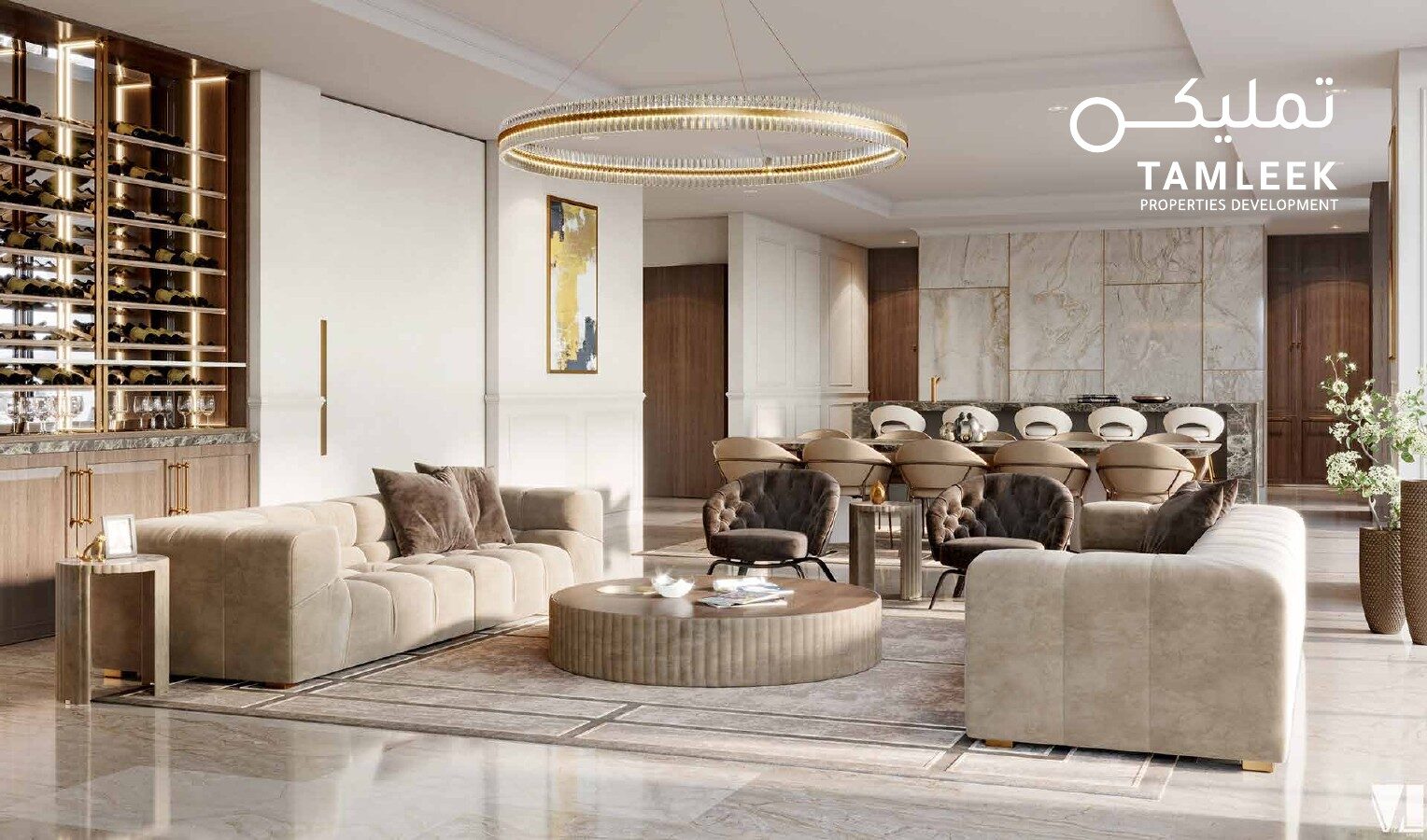
Logo & Website · 2020
Tamleek
A name that opens like a key.
- Sector
- Property Development
- Delivered
- Logo & Website
- Year
- 2020
The logo
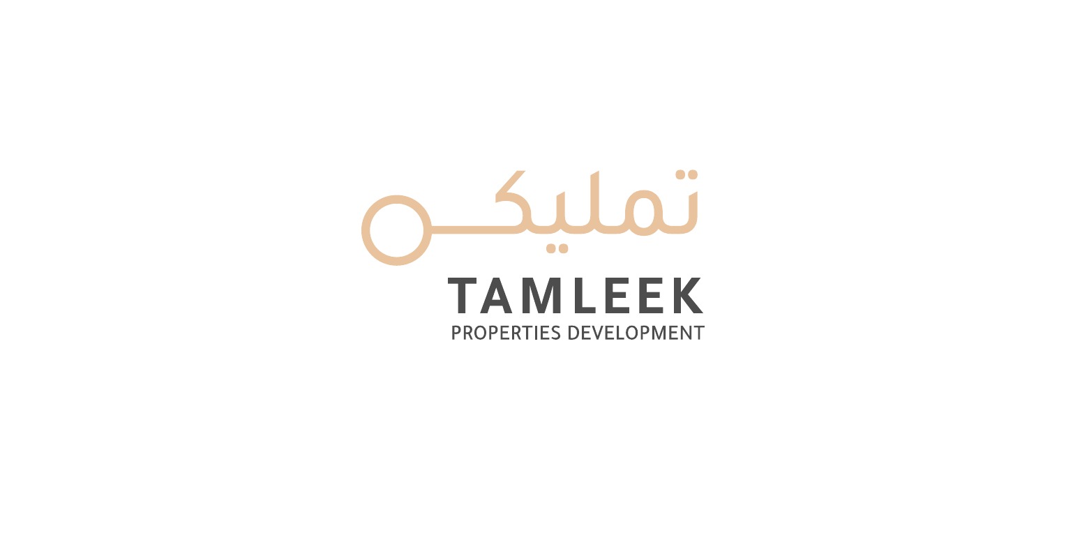
The key is in the name.
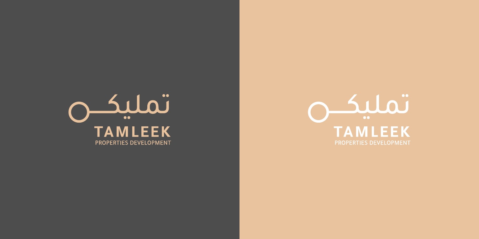
A logo for a property development company. The Arabic name stretches into the shape of a key, a simple sign of owning a home, in warm sand and charcoal.
Want something like this for your business?
Next work
Al Nawkhada Group
Start a project
YOUR PROJECT
BELONGS HERE.
Tell us what you are building or fixing. We will come back with the right questions and next step.
Start a project